Nature seems to have healing powers. Even a quick perusal of the internet lists a multitude of sources and research studies dedicated to, and in support of, the topic. Listed benefits include everything from improved sleep and a stabilized heart rate to reduced depression and increased social connectedness, to name just a few. As additional confirmation, there’s no reason to look any further than the recent pandemic when people were encouraged to head outdoors for respite.
Fortunately, one needn’t only be outside to enjoy the benefits of nature. Thanks to biophilic design and a focus on incorporating nature and natural materials into interior spaces, people can feel more connected with the outdoors while being inside their own homes. Calacatta Gold
This month, kitchen design experts share thoughts and projects related to biophilic design and bringing nature home.
Design tends to be cyclical, and currently – much to the delight of Elizabeth ‘Buffy’ Ferguson – biophilic design is having a moment.
“I’ve definitely seen more nature being brought in and requested by clients,” says the principal designer, Elizabeth Ferguson Design in Atlanta, GA. “But it’s also always where my mind goes creatively.”
The designer remembers the 1990s, when colors such as hunter green, warm red and gold were popular. So was glazed and painted cabinetry. Paint is coming back, but even more so is stained wood cabinetry.
“I think people are looking for warmth, not just in color, but also in feel…with texture and variation in finishes,” she indicates. “You definitely have all of that with wood and its different grain patterns.”
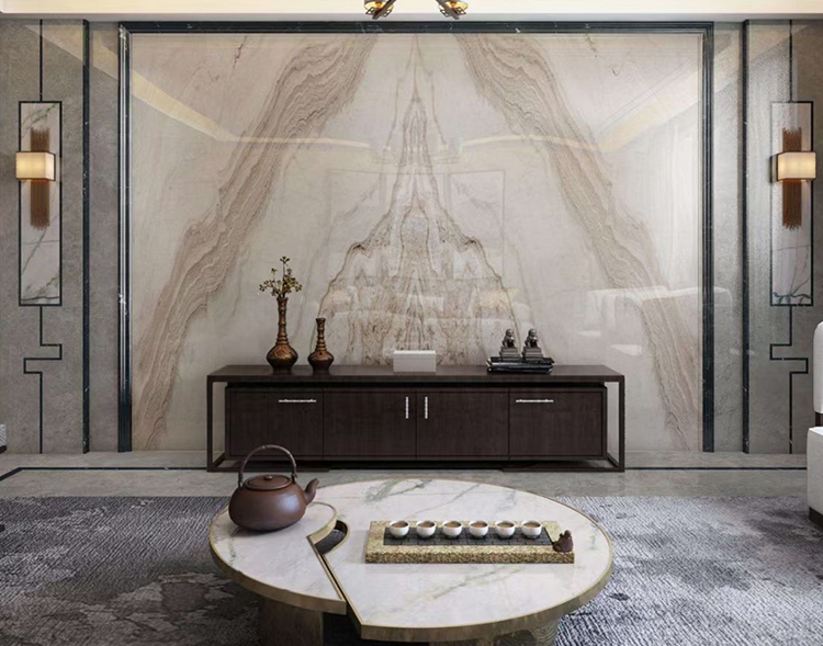
Marble, such as countertops and backsplashes, as well as other natural stones, such as Belgian Bluestone for floors, also have an innate ability to bring the outdoors in. So do oak floors. Zellige tiles, with their handmade, less-than-perfect construction, often find their way into her designs as well. Given their clay composition, they fit right in.
Several of these elements were featured in a new-construction show home where Ferguson served as the lead specification designer, collaborating with Morgan Creek Cabinet Company to create a residence inspired by nature. For example, the walnut entertaining island matches the perimeter’s bar area. Both complement the French oak floor. Marble countertops contrast with the dark, nearly black, laminate perimeter cabinetry and barrel-vaulted ceiling.
“The walnut is rich and warm,” she remarks. “So is the laminate and the ceiling. They are very dramatic and unexpected. The marble offers warmth as well, with a lot of movement. It also lightens up the dark elements and pairs well with the cabinetry colors. Overall, when you consider the entirety of the kitchen, it’s all the colors of nature…brown, cream and black, which I love.”
Ferguson also looks towards plumbing and lighting fixtures to add a touch of nature, especially those with warmer finishes such as antique and satin brass. Lighting fixtures shaped like natural elements, such as the linear ‘branch’ chandelier in the show home’s dining room, earn bonus points.
Lighting, in general, is a favorite element for the designer to incorporate into kitchens.
“We entertain so much in our kitchens so they aren’t only about function,” she explains. “I like to include cooler lighting for ceiling fixtures and warmer lighting for hanging fixtures or strip lights. It gives you the ability to create a transition throughout the day where you go from cool daylight to warm early evening light.”
Ferguson also appreciates lighting’s ability to personalize a space. “Lighting can help speak to what clients want their kitchens to look like,” she offers. “It provides an opportunity for a personal touch.”
Light, both natural and artificial, was a critical element in the show home, where a trio of windows above the range allow an abundance of natural light to flow into the space. Ferguson flanked them with a pair of vertically oriented linear sconces. Brass metal accents warm up the room, and opaque shades add another layer and tie the lights into the marble countertop. Two matching island pendants bring down the high ceiling and make the kitchen feel more intimate.
“They have such a great presence,” she says in reference to the island lights. “They really help to frame the kitchen.”
For the love of wood
Jason Vanderhovel notes that, over the years, his clients have tended to operate in extremes. Not long ago, espresso cabinetry was the thing to do. When people decided it was too dark, they jumped to white. White and off-white painted cabinets – as well as a few dark colors, including those one would see in nature – are still popular for a kitchen’s perimeter. However, stained wood, especially for an island, is a go-to element these days.
“We’re definitely seeing fewer painted and more stained kitchens,” says the v.p. of Dream Kitchens in Brighton, MI. “Here in Michigan, we can be outside, comfortably, for only so many months. By bringing wood into our homes, we can enjoy nature year ‘round.”
In particular, white oak and rustic hardwoods, especially alder and beech as well as a little bit of cherry, are the species of choice. The designer attributes white oak’s popularity to its ‘cooler’ undertones, i.e., less yellow, red or orange, compared to red oak of the 1980s and 1990s, while rustic woods bring heightened genuineness to a space.
“Our clients love knotty woods,” he relates. “Right now, it’s very infrequent where we don’t include a knotty wood species for the island. In a world of solid paints, knotty woods add some authenticity to higher-end, stained cabinetry.
“The natural grain pattern is each wood’s identifying characteristic,” he continues. “When the wood is stained, these patterns tend to show through and ‘telegraph’ the wood’s fingerprint. I love rustic beech, especially. Its long, exaggerated and beautiful knots lend such a unique, and wild, look to a kitchen.”
Vanderhovel suggested rustic beech recently for one client who included the distinctive wood for the island, floating shelves and ventilation hood surround. He paired it with dark, pewter gray perimeter cabinetry.
“Initially, these clients weren’t quite sure what they wanted for their new kitchen, except that they wanted a really light paint color for the walls,” he says, noting that their final selection was a very light gray. “To keep the room from being too cold and stark, we chose dark cabinets. Since that left us with gray [walls] on gray [cabinetry], we brought in the rustic beech to warm it all up. We often use stained woods – as well as brass hardware, which is coming back – to bring warmth to a design.”
Another recent project showcased rustic alder for the island as well as an accent for the ventilation hood surround. This time, Vanderhovel combined it with deep, dark green perimeter cabinetry.
“The dark green mixed with the stained wood brings outdoor colors inside!” he comments, adding that keeping the bulk of the dark cabinets at a lower level keeps the room feeling bright, while adding an accent or two at eye level helps pull the design together without shrinking the room.
Joni Spear of Joni Spear Interior Design in St. Louis, MO has always been a proponent of nature and of finding ways to bring it into the home. These days, her clients are also seemingly smitten with biophilic design, which she credits, in part, to a world wearied by COVID and an overindulgence of white-on-white kitchens.
“Everybody was wanting white…white cabinets, white counters, stainless steel…,” she says in reference to the pre-pandemic environment. “Then COVID hit. Everybody was at home and they realized that it was cold and sterile.”
While her clients typically aren’t able to fully diagnose the dilemma, they do know something is missing. For Spear, most often the missing element is nature.
“Nature calms us and grounds us,” she explains with regard to its influence and importance.
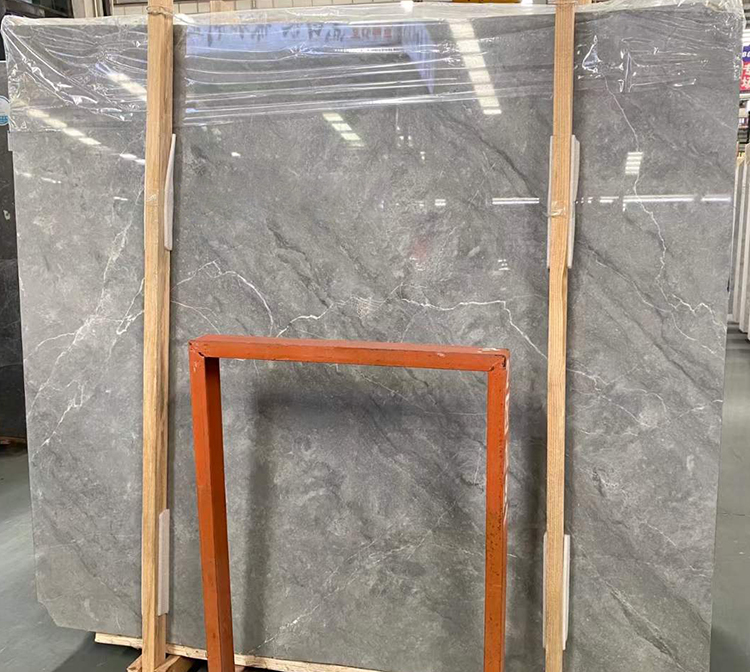
The designer often focuses on nature’s finest, including stone, wood, light and color. In fact, Spear often begins the design process by taking clients to look at natural stone slabs, which are often used as countertops and backsplashes.
“I’m a huge proponent of marble and quartzite,” she says. “They’re both ‘of the earth.’ Quartz manufacturers have done a phenomenal job of replicating them, but a true nature lover can see the difference.”
Spear recognizes that some clients may be intimidated by natural materials and their susceptibility to wear and change over time.
“Marble and soapstone, for instance, can scratch and stain,” she states. “But people are moving more towards the perfectly imperfect. They are understanding that we do live in our homes and that it’s okay if stone or wood scratches. That acceptance is allowing those materials to come back in.”
Natural stone was actually a design driver in her own kitchen, where Calacatta Vagli marble tops the island. As a rare – and admittedly expensive – material, she used butcherblock in the bar area and soapstone for the perimeters to keep costs more in line with her budget.
“I looked for over a year to find a less-expensive stone that equally ‘moved’ me, but I just couldn’t find it,” she says. “So, I compromised by using less expensive surfaces in the rest of the kitchen to allow for the splurge.”
Playing off of the marble’s green and gray veins, she chose green cabinetry – the color of parsley in a salad, she quips – for the island and bar. The tall cabinet that butts up to the bar was a salvage yard find that Spear refurbished.
“It was a hideous piece of furniture, but I cleaned it up, added legs and new paint and now it’s a highlight of the whole kitchen,” she relates.
To keep the colorful cabinetry from overwhelming the space, she paired it with another one of nature’s hues, this time a custom mushroom color for the perimeter.
Other natural elements that illustrate the perfectly imperfect is the barnwood accent on the ventilation hood surround and the zellige tile backsplashes and accent wall.
“In a past home, I had big terra cotta floor tiles,” she recalls. “They were made and sundried in the field…and they even had chicken footprints in them. My kids absolutely loved them! When I was looking for natural materials for this kitchen, I came across these handmade zellige tiles. They are stunning, even with their uneven edges and pitted surfaces.”
Given their pearlescent finish, Spear appreciates their ability to reflect light, which is another essential natural element in her designs.
“As much as possible, we try to take advantage of natural light,” she stresses. “We’ll add or enlarge windows when we can. Solar tubes can also be a fairly easy solution for bringing in more light from above. And, if there’s a view to take advantage of, we’ll hone in on it.”
Over the past 10 to 15 years, Brenda Denny has seen increased interest in wellness-related businesses (organic foods, fitness, mental health, etc.) as well as sustainability across all sectors (architecture, energy, etc.). That appeal has translated into increased interest in the use of organic and natural materials throughout her clients’ homes, including in their kitchens.
“Nature is good for our souls,” says the owner/lead designer of BKD Interiors in Houston, TX. “When we introduce natural and organic materials into a space through wood cabinetry, stone countertops, natural lighting, etc., they create a warm and relaxed feeling. For example, natural stone slabs, such as granite, quartzite and dolomite, bring beauty, color, warmth and depth into the space, as well as a sense of luxury. These stones are also very durable and are great for a kitchen, so they are always my first choice for countertop materials.”
In fact, natural stone is her favorite natural element in the kitchen of a recent renovation where Denny transformed her client’s childhood home into a new space that reflects her love of gardening, hiking and the outdoors. The room also highlights her pottery collection, which features handmade artisan pieces gathered from her travels.
“I love the stone’s rich brown color,” she relates. “It has a beautiful range of colors, and its leathered finish adds texture and reminds us of its earth origins.”
The designer complemented the natural stone with sintered stone, which, although manmade, is comprised of from-the-earth materials. It tops the coffee bar at the end of the island as well as the kitchen’s perimeter. The chosen pattern mimics that of natural stone to continue the nature-inspired theme.
The designer also commonly uses stained wood, especially maple, cherry and mahogany, for cabinetry and flooring because it brings a lot of warmth and life to a room. Likewise, live-edge wood surfaces, as well as rolled iron, can accomplish the same effects.
“We love wood’s depth and dimension, too,” she adds. “The pattern in wood, as well as natural stone, extends your eye beyond the flat surface, helping to expand the space…similar to how a mirror expands a space.”
Wood was an important element in this kitchen, where the coffee bar’s foundation – a treasured family heirloom – combines with stained cherry cabinetry to add warmth. Around the kitchen’s perimeter, open cabinets are backed with linear, organic tile comprised of metal and multi-colored wood to create a backdrop for displaying the client’s cherished pottery. At the island, wood combines with glass and iron to form vertical and horizontal shelving that provides easy access to additional pottery pieces and coffee mugs. The iron’s raw finish softens the harshness of the metal and makes it feel more organic.
Denny also often calls upon glazed ceramic tile to bring nature into a space. In this case, she included blue subway tiles for the backsplash.
“We wanted to bring in some color,” she says, “and these tiles have a watercolor effect that offers variation and makes it feel more relaxed and ‘flowy’ compared to the harsher metal and dark-colored island cabinetry.”
Given Southern California’s Mediterranean climate and stunning coastal landscape, it’s relatively easy to see why Susan Wintersteen’s clients are drawn to the outdoors. Likewise, it’s also relatively easy to see why they want to bring it inside their homes.
“We feel free and open outside,” says the principal designer, Savvy Interiors in Solana Beach, CA.
Less obvious, she indicates, is nature’s ability to take us back to a potentially simpler time.
“On a more childlike level, as adults investing in our spaces, we want to go back to the carefree days of being a kid,” she says. “There’s something very comforting about running outside, laying in the grass, picking dandelions and climbing trees. We want to be comfortable in our homes, too, especially because our lives are so much more complex with so many stressors trying to capture our attention. Creating a space that is calm and peaceful with a more organic feel juxtaposes against the demands on everyone’s time and energy. The materials we choose can help us feel more comfortable in our spaces.”
For many of Wintersteen’s clients, bringing the outdoors in translates to elements with a matte finish. With regard to wood, she is seeing more species with an open grain, especially European oak that is blonde, bleached or, at the opposite end of the spectrum, black. Walnut, which offers warmth, is also popular.
“A lot of people who want a natural and organic feel want to see the grain in the wood,” she explains. “But, they don’t want the grain of their parents. Instead, they want something that feels spa-like and organic, like it came from the ground.”
For example, light-colored European oak is the predominant component in one recent kitchen project, where it makes an appearance in both the cabinetry and the flooring. Custom stained to match each other, Wintersteen added a v-groove detail to the cabinetry to set it apart from the floor and to provide interest. As an accent, she highlighted a single wall cabinet with arched doors, reeded glass and green paint. The latter references the view, which is visible through the flanking black-framed windows.
“The black around the windows acts as a picture frame to the outside,” she relates. “These clients don’t need any art because they have the trees and shrubs outside. I also love the reeded glass and green paint. All of those elements together…the green, the glass, the wood…speaks to an organic, comfortable feel that is nature-inspired.”
Reminiscent of the organic nature of wood, Wintersteen featured marble as the countertop and backsplash. For added drama, she chose fully contrasting colors, dark for the island top and light for the backsplash, perimeter countertop and apron front for the sink. In general, natural stones – especially quartzites like Taj Mahal and Mont Blanc – are frequently requested as a countertop or a full-height backsplash.
“We’re getting away from white quartz that has a more manufactured look,” she indicates. “Instead, clients are looking for more organic textures and colors of natural stone.
“A lot of quartzite has really interesting patterns, depending on where they are quarried,” she continues. “When you see that pattern, you know it came from the earth. There’s something very organic about that, about knowing that it isn’t something that can be repeated. And, you accept any imperfections, recognizing that it’s part of nature.”
To continue the matte theme, stones are often honed, leathered or even raked. The latter is the most dramatic, offering a ribbed finish consisting of tiny grooves reminiscent of drawing a rake through sand. ▪
You must be logged in to post a comment.
© – All Right Reserved. Designed and Developed by FreshDesignStudio
Marble Kitchen Top This website uses cookies to improve your experience. We'll assume you're ok with this, but you can opt-out if you wish. Accept Read More